Chocolate Packaging
September 22, 2020. Design Studio
Practice:


From today’s activity, I explored the geometry of tab and slot fastened in the middle and on both sides. Without using tape, I learned how to secure a lid of a box just by using the force of friction. My goal for this project is to craft an aesthetically appealing carrier that prioritizes function and protection. For gift quality chocolates, people need presentable carriers with thought put into the packaging. I also aim to have all the chocolates fastened in place so they can stay unbroken and faced up right as long as I don’t purposefully shake the carrier too hard.
Prototype 1:
packaging no.1


For my first sketch model, I went for a simple and straight forward design that creates a sturdy packaging for 6 chocolates on one single layer. Using three separate sheets of paper, I managed to use a sleeve cover to wrap everything in place without falling apart. This type of packaging also makes the manufacturing process simple and cheap. The size and weight of this type of packaging is easy for people to grab and put in other bags. For children and elders, it also provides an easier grip.
Cons: It is uninteresting to look at for a gift packaging.
packaging no.2


For my second attempt, I decided to create a carrier that opens in an interesting and fun way. Inspired by the geometry of drawers, I wanted the carrier to unfold while keeping the chocolates in place. With this kind of packaging I am able to fit double the amount of chocolate and separate them by shape and size.
Cons: With a more complicated layout, it was a challenge for me to get the correct measurements and make things fit together. I will need to come up with a more sustainable solution to prevent the packaging from falling appart.
packaging no.3


A simple abstract of a more aesthetic looking carrier that does not function as it was intended to be. This is more of an exploration of a more gift quality packaging rather than just function.
Prototype 2:
packaging no.4


This was a second iteration of packaging no.2 that completed the shelves on both sides and fastened everything in place. This time I was able to fasten the second drawer in place without using tape, but it made one side of the cardboard soft due to the weaving. I thought this packaging had the benefit of multiplicity since it is able to contain other objects after the user finishes the chocolate.
Something that I want to improve in the future is craftsmanship and make the carrier look like it was made for gift quality chocolates. I received feedback from my peers about having the packaging resemble what it contains and I will aim to achieve that for my next iteration.
Prototype 3:
packaging no. 5

In the refined version, I adjusted the measurements and managed to craft a sturdy carrier without any creases or tape to hold together. Instead, I only used tape to cover up two mistakes. After crafting the functioning part, I started to consider the qualities mentioned in class, which brought me to my next mission: how do I tell it’s for chocolate just from the outside?


To accomplish this, I sketched out a few ideas. First I thought of a geometrical cover that forms triangles on both sides. Then I considered bows and wrappings to cover ugly tabs. With the combination of a neatly designed appearance and an explosive effect when opening the carrier, I hoped to make the act of gift giving a fun and suprising experience.


Whether individually wrapped or not, this layer of cardboard can be easily replaced for different objects. Meaning it’s a reusable carrier for sustainable use even for objects other than chocolates.


The previous covering tab was rough and unfitting for a chocolate packaging so I experimented with a belt instead.


This type of design made the carrier look more like a food packaging rather than a toy. However, I also wanted experiment with string making out of cardboard to make a bow.


With the help of my classmates in studio, I was able to learn how to make a cardboard string. It is tedious work but I’m sure I will improve or maybe switch to a wide ribbon.

Each three elements added to this carrier has it’s pros and cons, however I plan only to keep at most two of these elements.

Prototype 4:
packaging no.6


This version takes on a couple issues mentioned in class. First, I wanted to add more rounded elements to make the packaging resemble the object more. Then, I adjusted the opening process by simplifying the steps. Compared to the previous version, the closing part isn’t as durable but it does make the using process easier. I will continue to find that balance.

Initially, I planed to create an elastic band that wraps around a round button. However, even after consulting Sam about how she made string, I still felt it was wrong to use the cardboard this way. Maybe this string method is the wrong direction.


Even though handles are not necessary for a chocolate box since it is relativly compact and isn’t easily damaged. I found 3 possible ways of carrying it, including using the bow part as an alternative handle.
Inclass Feedback:
“It for sure looks like a gift box, but our initial reaction is that it is really large for the chocolates and uses a lot fo cardboard. We have mixed feelings about the way it is carried — some of us enjoyed the concept of it being carried under your arms and others felt that it could be difficult to transport due to no handles. The middle gif was not working for us so we could not see everything so if we missed something thats why, ahaha. We enjoyed the tie as it made it feel more gift like. When we think of opening a box, we think of opening it with tie on top with the box down. However, this box opens while on the side (or at least looks that way) due to the placement of the ties. When youre opening the carrier, the way it pushes against your body seems midly uncomfortable due to the corners — maybe if you rounded the corners it could be a little more user sensitive!”
Questions:
How well does the carrier describe what it contains? Why?
“Not super clear due to size and shape from the outside. But on inside makes more sense. We think that it could be really really cool if you shrunk the box down proportionally”
Does the carrier appear easy to assemble? Why?
“without instructions we feel it could be difficult as it is a more complex design but we like that it is all one piece”
Does the carrier adequately indicate how it should be carried? Why?
“yes and no. there are no handles but with a box it is clear that you could potentially carry it in many ways”
Do you believe the carrier effectively protects its contents? Why?
“depending on your hold it it may or may not”
Does the interaction with the carrier appear appropriate and engaging? Why?
“yes and no. the idea of a gift box is engaging and looks super cute, but the box is rather simple itself.”
My Plan:
- change how the chocolates are held into a simple hole instead
- change the closing mechanism of the box to make sure it clearly indicates which side to open from.
- not be attached to the string idea
Prototype 5:
packaging no.7

By changing the opening to the top of the box, this version is more clear of which way it should be opened while resembling the shape of the chocolate itself. The two wings also provide a handle-ish shape that helps the carrying process.

The interior is about the same as last version’s, but this time I simplified the holding part inside each section. I realized it was possible to avoid using separate pieces for that section afterwards, but I also thought the separateness could also have it’s purpose.


Feedback: Not sure about how this “handle” can be used easily.
Final Iteration:

Since the closing system before required the user to twist the cardboard, which makes the packaging more vulnerable, I decided to come up with more ideas.
first try:
When constructing the last stage, the handle/closing part, I accidentally scored the cardboard on the wrong side and the handle broke off. Devastated, I had to try again and strengthen the handle part.


second try:
With careful measurements and more delicacy, I successfully finished my final iteration.


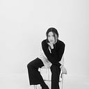
Conclusion:
The photos came out darker then expected but I thought it fitted the chocolate brand. As a couple friends would say, it “looks like an advertisement/ campaign for mysterious and exotic chocolates”. I have mixed feelings about this project because it was a frustrating process with many issues to worry about all at once. However, I thought this project gave me the reason to work in studio with my peers in this pandemic. It was easy to give and ask for feedback while working in studio, and it was also interesting to see how others worked on their projects. I find myself liking studio more and more even though it was kind of(very) messy.